Pricing pages are some of the most valuable pages a software company has. They're where interested visitors decide whether to buy. They're also, in my experience, some of the least looked-after pages from an SEO point of view, because everyone is focused on the numbers in the table.
So for this teardown we picked one: the pricing page of Onbixo, a user onboarding product. It turned out to be a good page with a few very typical gaps, which makes it a useful one to learn from.
The headline
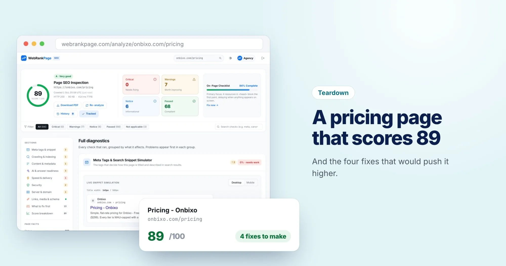
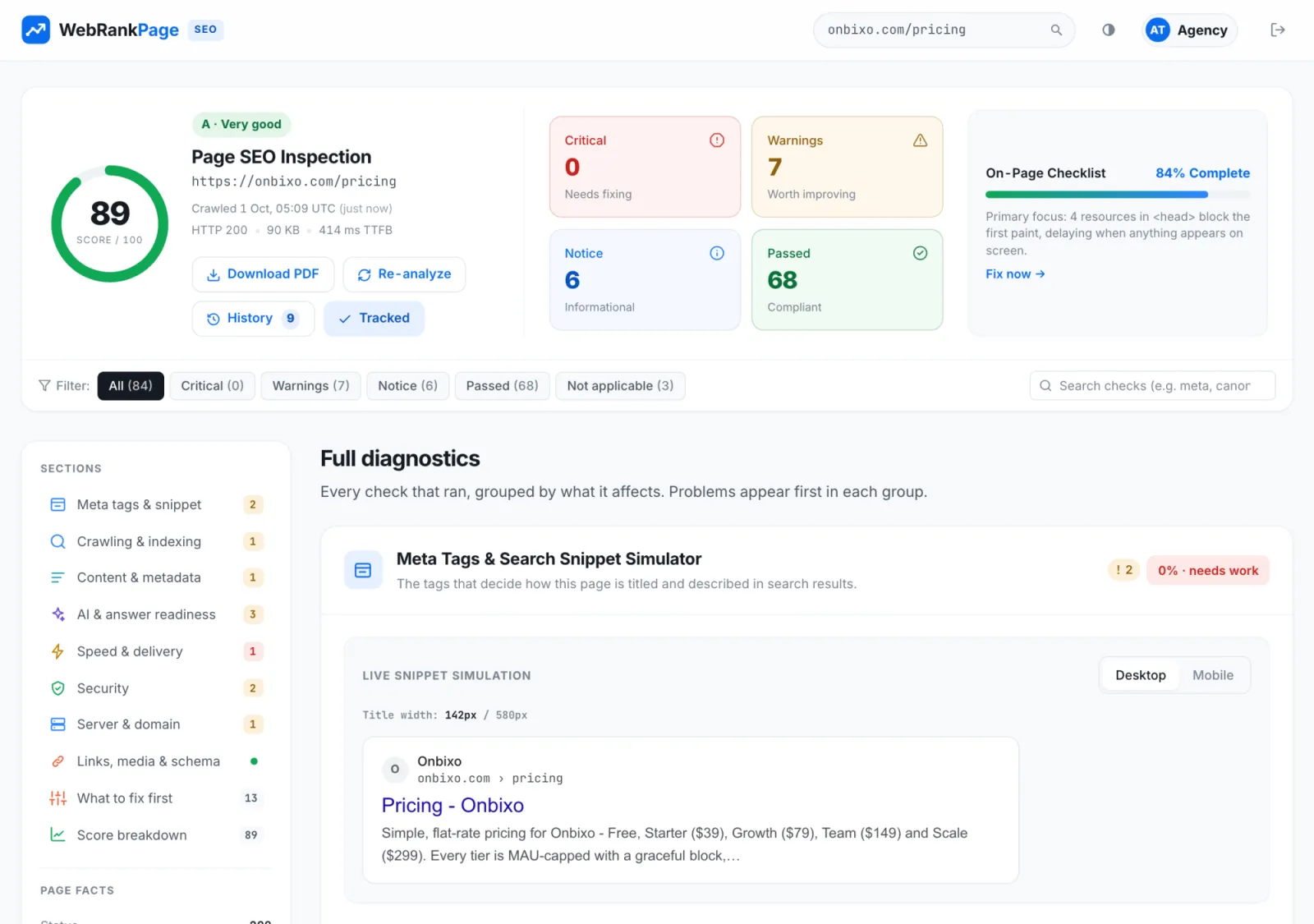
89 out of 100, graded A. No critical issues, seven warnings, six notices, and 68 checks passed. If your pricing page scores this well, you're ahead of most.
What it does well
- It's easy to index. The page answers 200, the canonical points at itself, and nothing blocks search engines. Crawling and indexing scores 94%.
- It has real content. At 1,513 words with 120 internal links, it's not a bare price table. It explains the plans, which gives search engines (and AI assistants) something to work with.
- The server is quick. A 414 ms time to first byte is a solid start.
Fix 1: The resources blocking the first paint
The report's top priority is that four resources in the <head> block the first paint. Until they've downloaded, the visitor sees a blank page.
This is the change worth the most, because it affects every single visit. The usual fix is to add defer to scripts that don't need to run before the page appears, and to inline the small amount of CSS needed for the top of the page while loading the rest afterwards.
Fix 2: A title that undersells the page
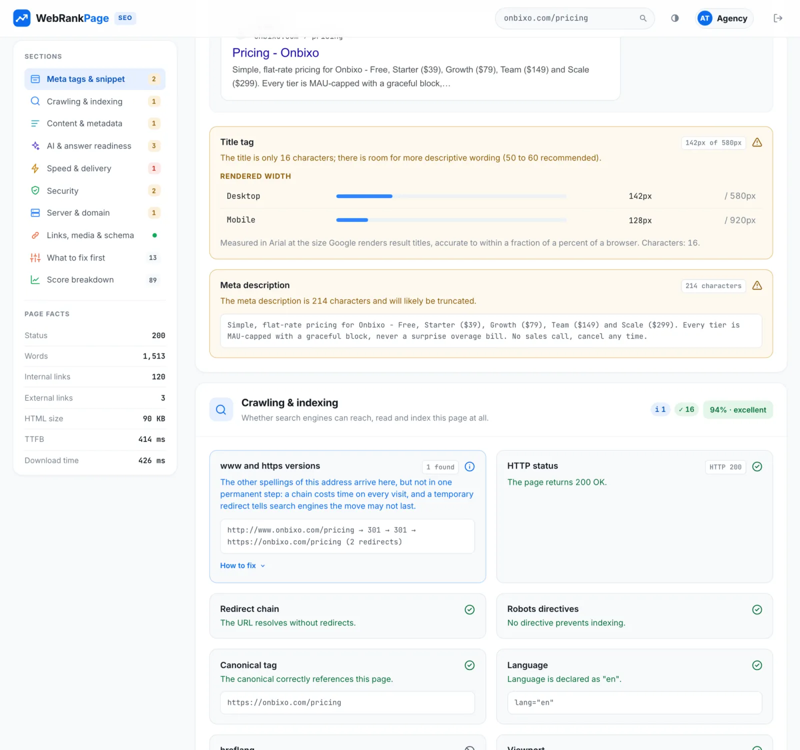
The title is "Pricing - Onbixo": 16 characters, using 142 of the 580 pixels a desktop result allows. That's a lot of empty space on one of the most important pages on the site.
Someone searching for the product's pricing wants to know, at a glance, roughly what it costs and what kind of pricing it is. Something like this uses the space far better:
<title>Onbixo pricing: flat-rate plans from free to $299 a month</title>Fix 3: A description that gets cut off
The meta description has the opposite problem. At 214 characters it's too long, so search results will cut it off.
And look at what gets cut: the end of the list of plans and prices, which is exactly the information a searcher wants. Moving the key facts to the start, and trimming to around 150 characters, keeps them visible:
Flat-rate plans from free to $299 a month. Every tier is MAU-capped with a graceful block, never a surprise overage bill.Fix 4: One redirect too many
Visitors who arrive at http://www.onbixo.com/pricing reach the page in two redirects instead of one. It's not serious, but each hop is a round trip before anything loads. Redirecting the http://www version straight to the final https:// address in a single step fixes it.
The takeaway
None of these is an emergency, and that's really the point. Most pages don't need dramatic changes. They need a handful of specific, small fixes, and the hard part is knowing which ones. A title and a description take ten minutes to rewrite. The render-blocking fix might take a developer an afternoon. Together they'd likely push this page into the mid 90s.
Curious how your own pricing page holds up? Run it through WebRankPage. It's free.