Try this with any page you've published: copy just the headings into a blank document, in order, and indent each one by its level. Then read it. If that outline tells you what the page covers and in what order, the headings are doing their job. If it reads like a ransom note, they aren't.
That outline is close to what a screen reader user gets when they jump between headings, and close to how search engines and AI assistants work out which part of a page answers which question.
One clear H1
The H1 names the page. Google has said that more than one H1 won't hurt you in search, so this isn't about a penalty. It's about clarity: one H1 means there's one obvious answer to "what is this page?"
It doesn't have to match the title tag word for word, but the two should obviously be about the same thing.
H2s that read like a table of contents
Read your H2s alone. Someone skimming should be able to tell from them what's on the page and find the part they came for. "Overview", "Details" and "More info" fail that test. "What's included in each plan" and "How billing works" pass it.
H3s then divide an H2's section, and H4s divide an H3's. Each level belongs to the one above it.
Don't skip levels for the look
This is the mistake I see most. A designer wants a small heading, the H3 style is too big, so an H4 goes straight under an H2. It looks right. The outline now has a hole in it: an H4 whose parent H3 doesn't exist.
Accessibility guidance recommends against skipping levels, because people navigating by headings lose their place. The fix is to separate meaning from appearance:
<h3 class="heading-small">Annual billing</h3>Pick the level the structure needs, then style it however the design wants.
Headings are not for font size
The reverse happens too. A big promotional line ("Trusted by 2,000 teams!") gets an H2 because it should look big, and the outline fills with slogans. If text isn't the title of a section that follows, it isn't a heading. Use a paragraph with a class.
Questions, where they fit
On FAQ-style content, a heading phrased the way people ask ("Can I change plans later?") followed by a direct answer is easy for readers and machines to match. Monika wrote about why assistants quote passages like that. Don't force it everywhere, though. A pricing table doesn't need "What are the prices?" above it.
A real example: Onbixo's pricing page
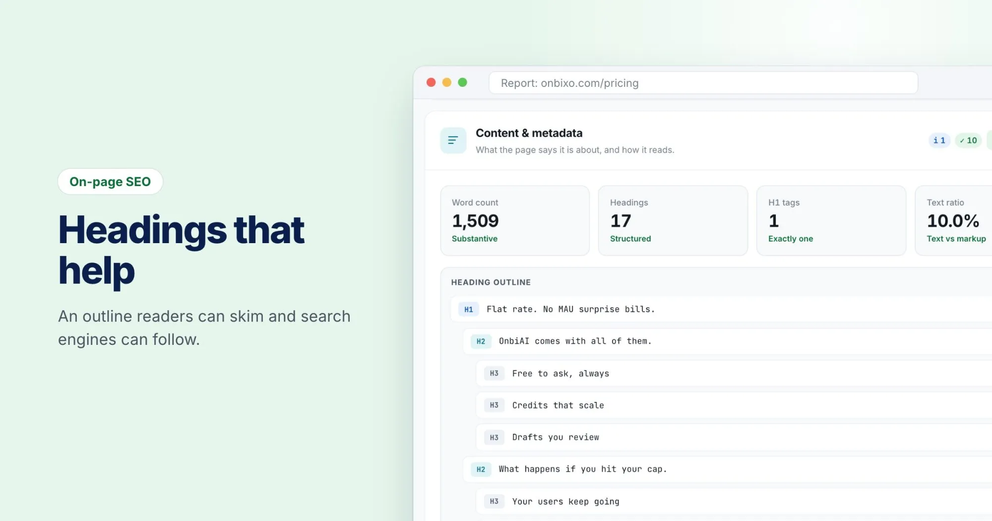
I ran a WebRankPage report on onbixo.com/pricing. The H1 is "Flat rate. No MAU surprise bills." That's a good one: short, specific, and it says what the page is about and why it's different.
The page has one H1 and 17 headings in all. The report also flagged one hierarchy note: the outline skips from H2 to H4. It's a small thing, and probably the "chosen for size" mistake above. Changing that H4 to an H3, and keeping its styling, closes the gap without any visible change on the page.
Seeing your own outline
The Content & metadata section of a report shows the heading outline as it was read, indented by level, next to a count of H1s and headings. Skipped levels and empty headings get a finding of their own. It's the same exercise as copying your headings into a document, minus the copying.