The PDF you send a client rarely stops with the person you sent it to. It gets forwarded to a marketing director, attached to a board update, dropped into a shared drive and opened again six months later by someone who joined after you started. Most of those readers have never met you.
Abhinav has already covered the monthly reporting routine. This post is about the file itself: what makes a report look like your work, and what to leave alone.
What a reader looks at, in order
Watch someone open a report they didn't ask for and the pattern is very consistent:
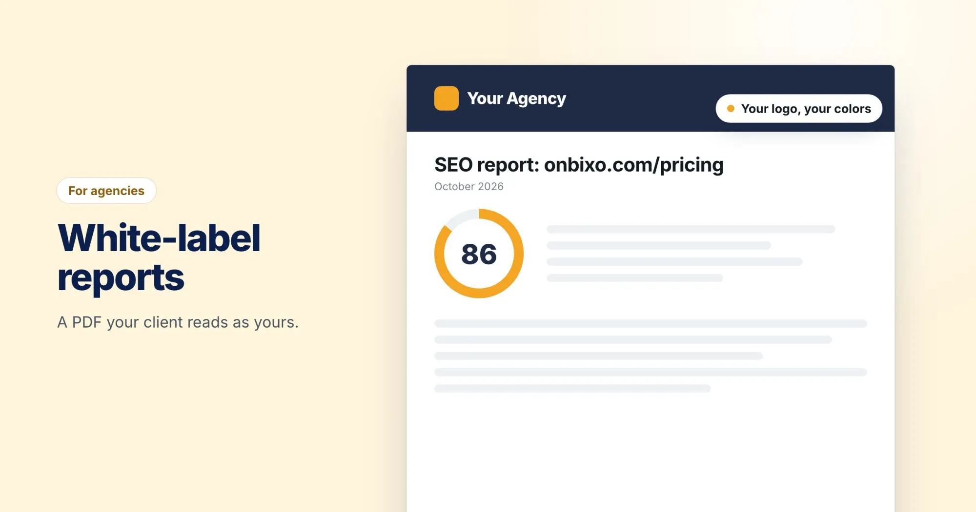
- Whose is this? The top of the first page. A logo and a name answer it in half a second.
- Is it good or bad? The score, and whatever color sits next to it.
- Who do I ask? They skim to the end looking for a name or an email address.
Everything between those points matters to the person doing the work. For a forwarded reader, those three are the report.
Put your name on the frame, not on the findings
The parts worth branding are the ones that say who stands behind the document: the masthead, the accent color, the footer on every page and the contact line at the end.
The parts that shouldn't change are the ones a reader has to interpret. Severity colors are the obvious example. Red for a critical problem and green for a pass are conventions everyone already understands, and an on-brand palette that turned critical issues teal would make the report look nicer and read wrong.
Small details that make it feel finished
- Use a logo that works small. A wide wordmark with a tagline underneath turns into a grey smudge at masthead size. A simple version of your mark works better.
- Pick an accent color with contrast. Pale yellow on white looks fine on your website and vanishes on paper.
- Make the contact line a real person. "hello@" is fine, but the name of the account lead is better. Clients reply to people.
- Write a footer you'd be happy to see on page twelve. Your agency name and website is usually enough.
How branding works in WebRankPage
White-label PDFs are included on the Pro and Agency plans. Each workspace has its own Branding page, so an agency running several clients can give each one a different setup if it needs to. Changing it is for workspace admins.
There are five settings:
| Setting | What it does |
|---|---|
| Name | Replaces ours in the masthead. Up to 80 characters. |
| Logo | Shown in the masthead in place of the name. PNG, JPEG or GIF, under 512 KB. |
| Accent color | Used for the rule under the masthead and the headings. |
| Footer line | Sits at the foot of every page. Left blank, it uses your name rather than ours. |
| Contact | Printed at the end of the report under "Questions?", so the reader knows who to ask. |
The branding applies to every PDF the workspace exports, both the single report and the before and after comparison. The findings themselves are unchanged, and severity colors stay as they are, for the reason above.
One detail I like: the branding comes from the workspace of the person exporting, not from whoever first analyzed the page. If a URL has been run by someone else, your export still carries your name.
The logo has to be a raster image. An SVG won't render in the PDF, so export a PNG of your mark first.
Check it the way a client will see it
After saving, use the See it on a PDF link on the Branding page and export one report. Then open it on your phone, because that's where a forwarded attachment usually gets read first. If the masthead tells you whose report it is before you've scrolled, you're done.
Plan details are on the pricing page, and the docs walk through the Branding page field by field.